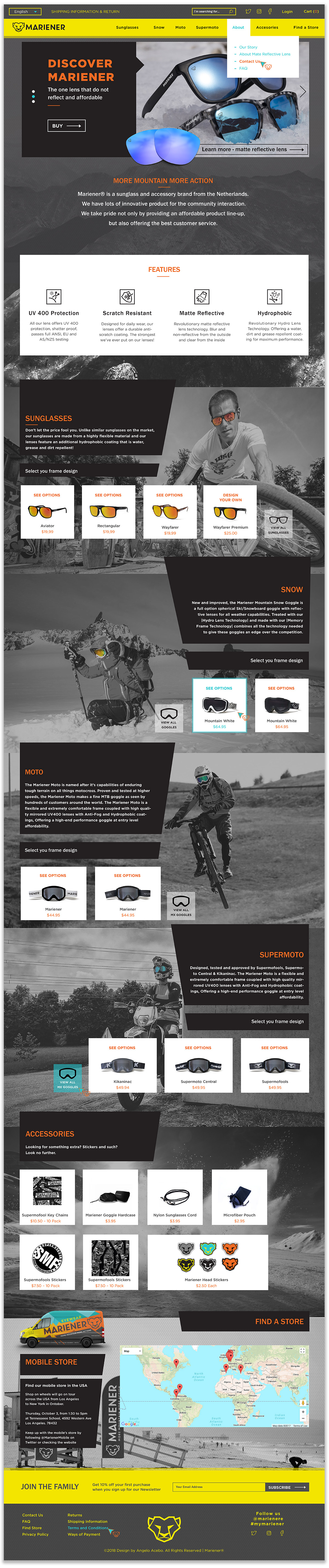
Mariener is a Dutch company design affordable outdoor eye-wear that incorporates innovative lenses, custom frames, and are built to resist weather and conditions of extreme environments sport.
Collaborators group project:
Andres Lopez and Angelo Acebo
Andres assisted for color choices and photo selection to set the style of the website and Angelo design the logo, typography, website design layout, copywriting, photo edition, promotional and branded content.
Challenge
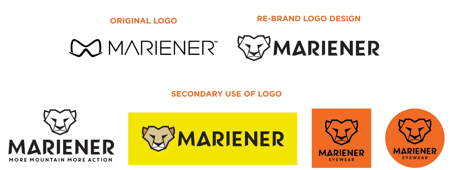
Although the product is unique and innovative, the current logo and branding do not represent this.
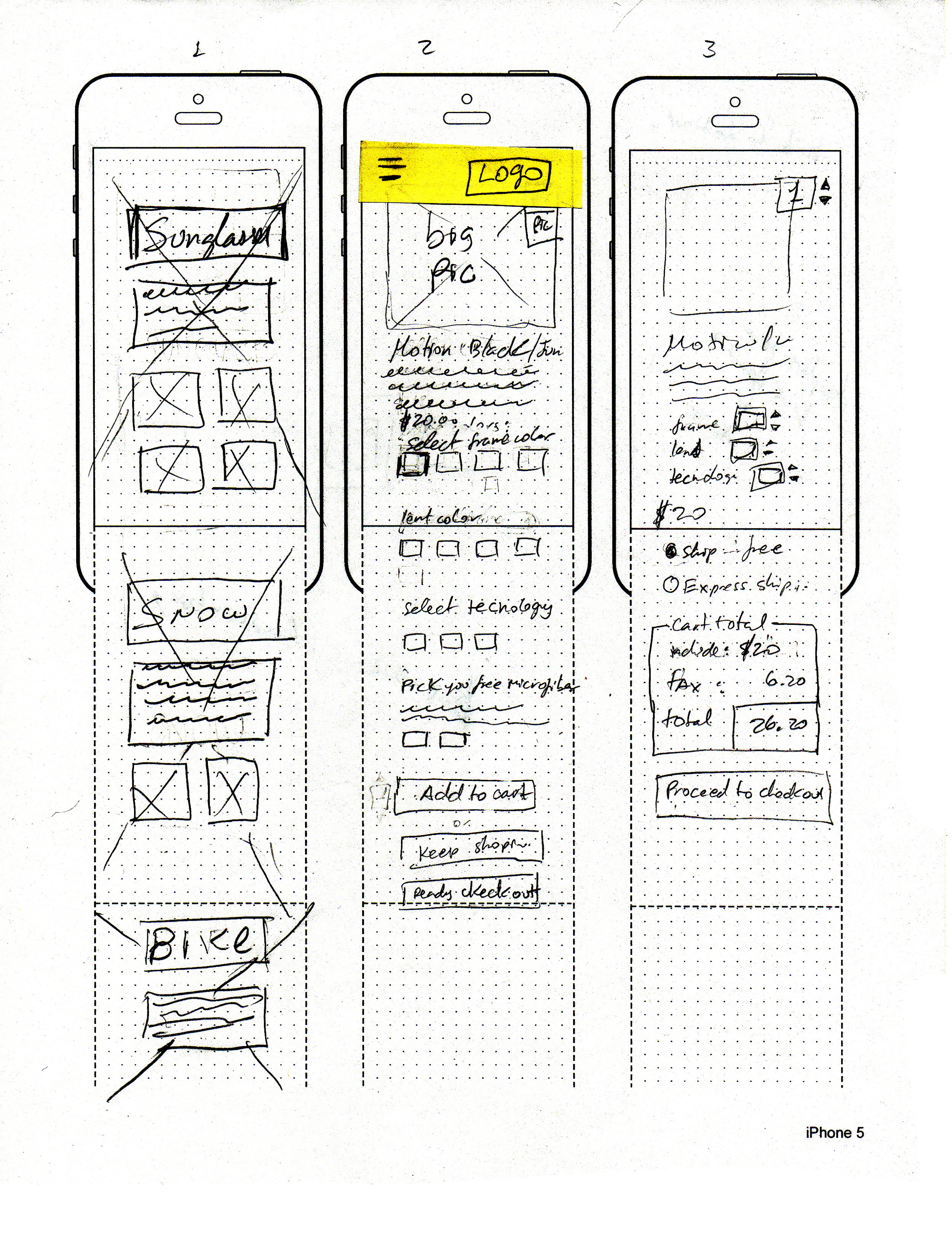
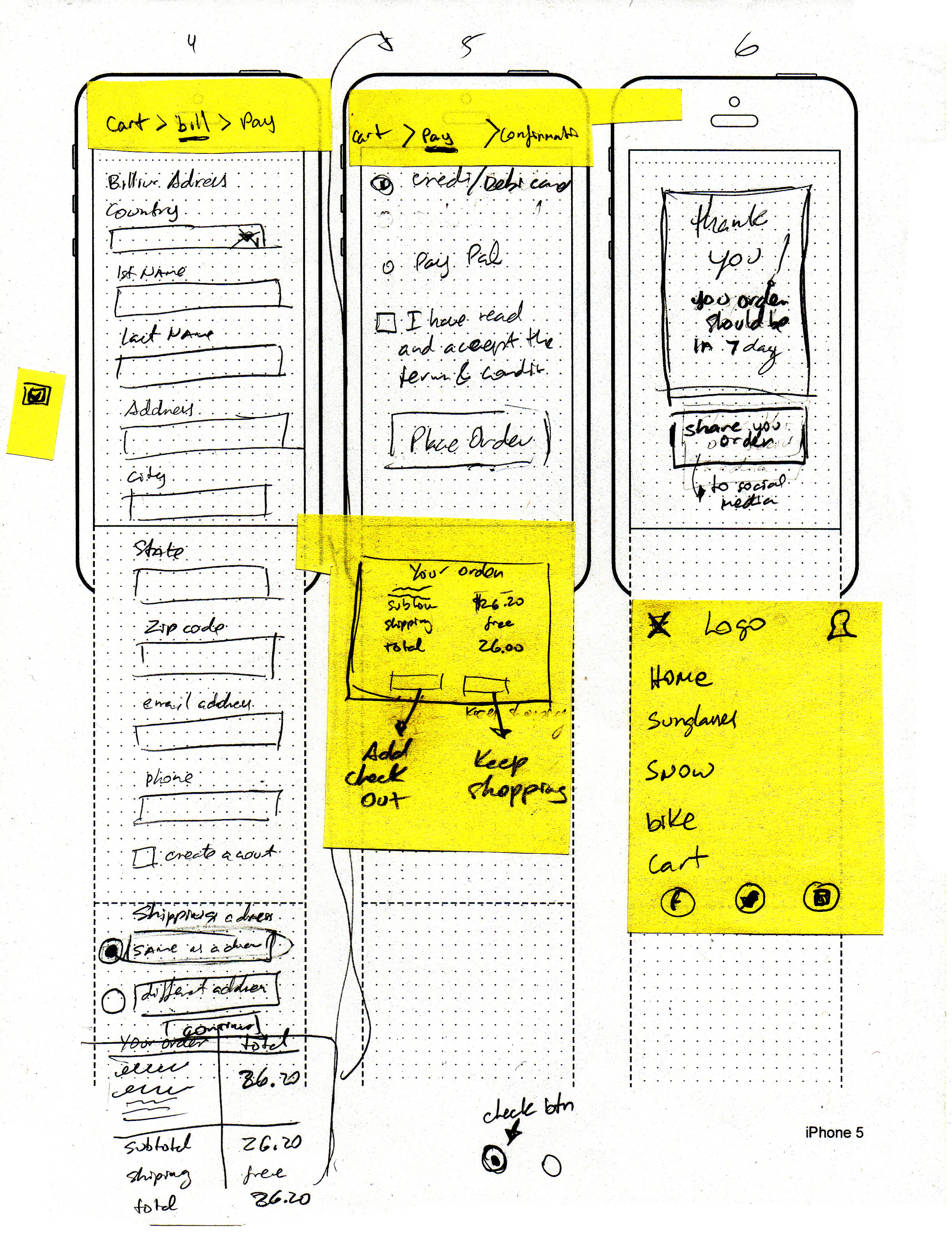
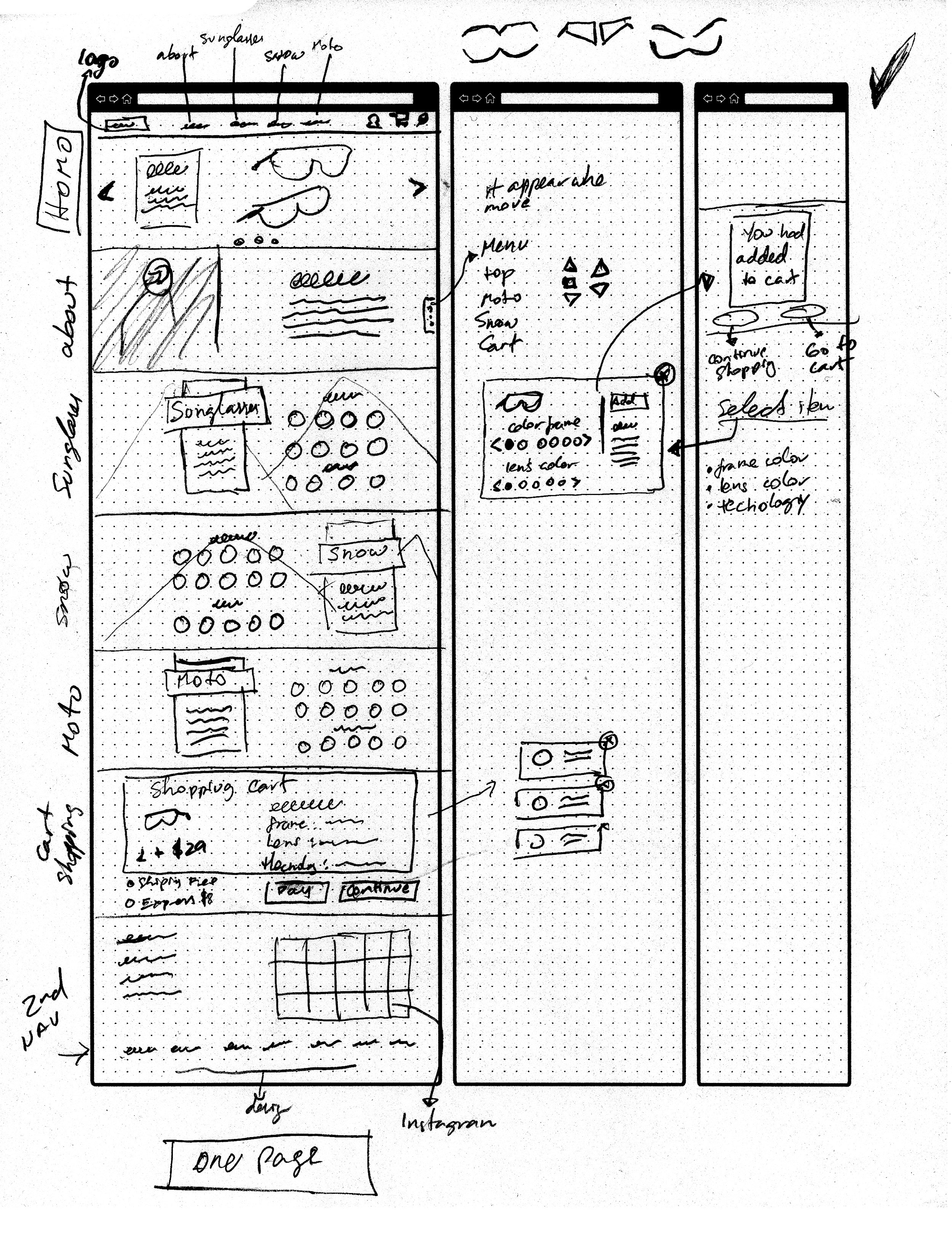
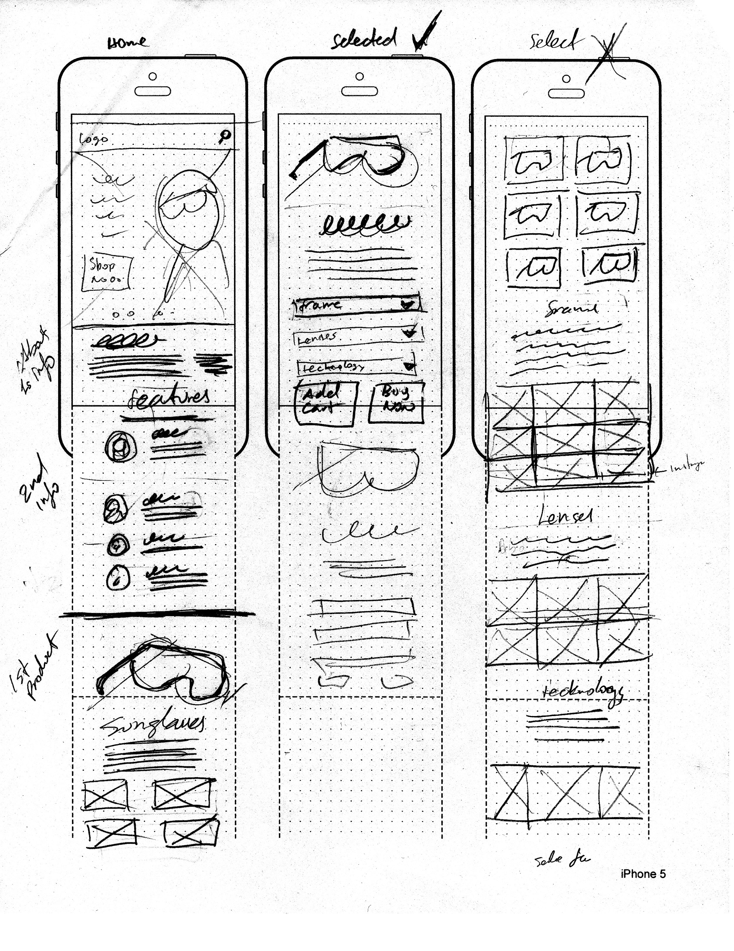
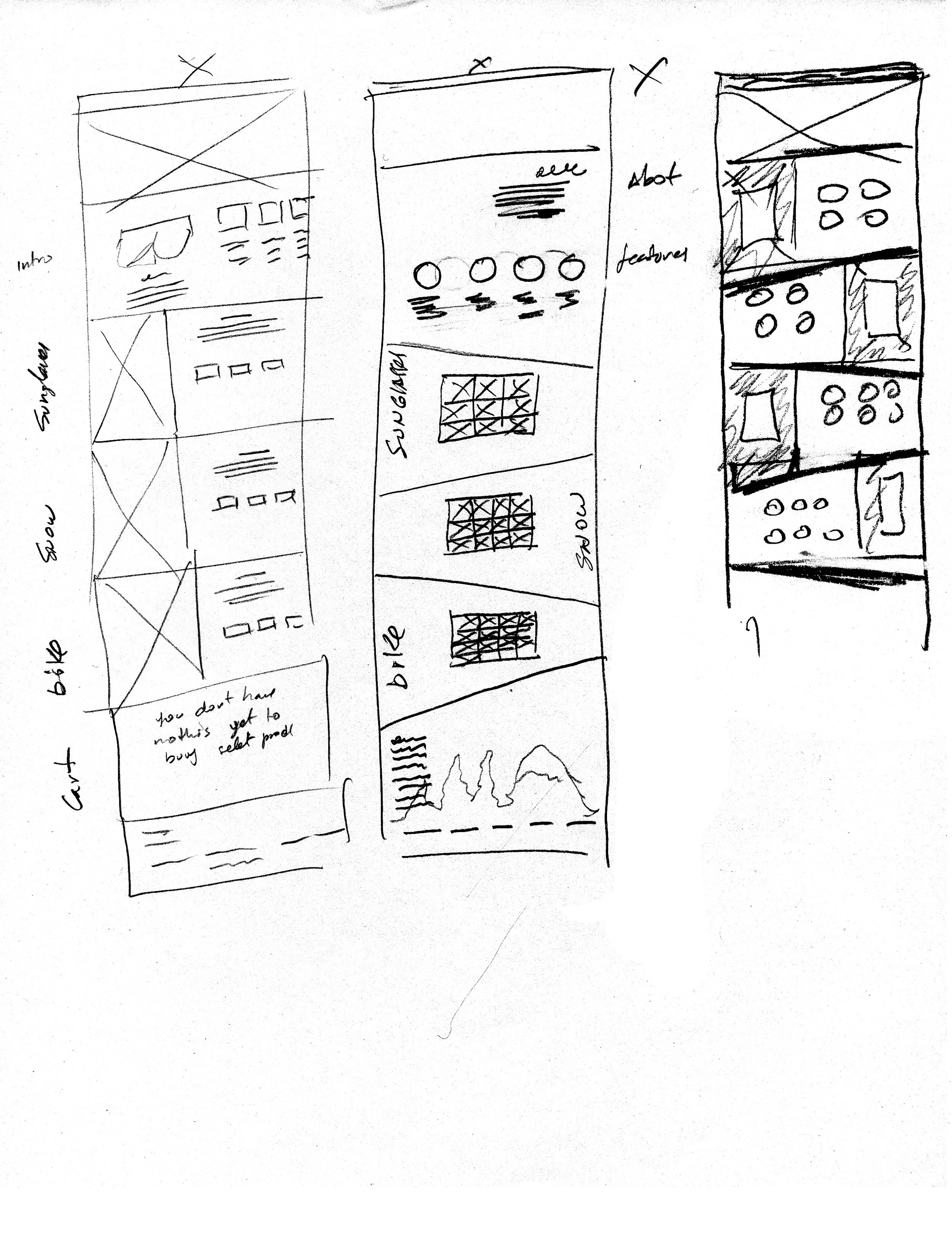
The website has a lot of information and becomes repetitive for the user. It also lacks vibrancy and modern elements to make it more appealing.
Solution
To bring life into this brand and identity we want to mimic the energetic nature of the activities product is used for. Also we wanted to use colors that represent both the warm and cold tones of the various eviroments where the product is used.
Logo Research


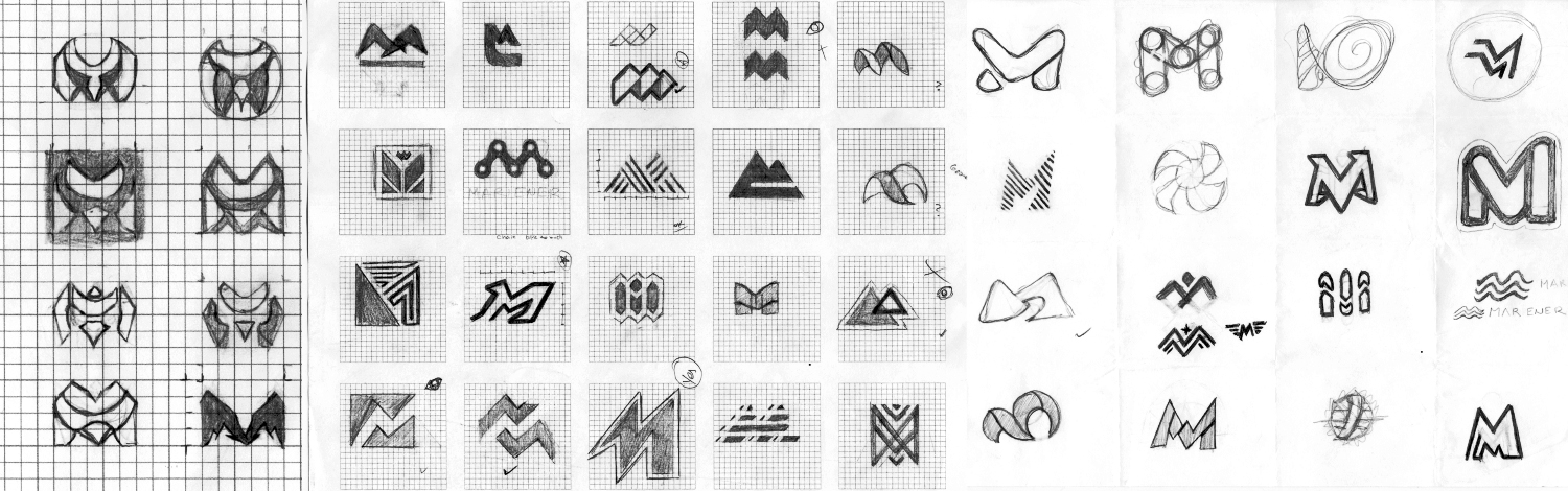
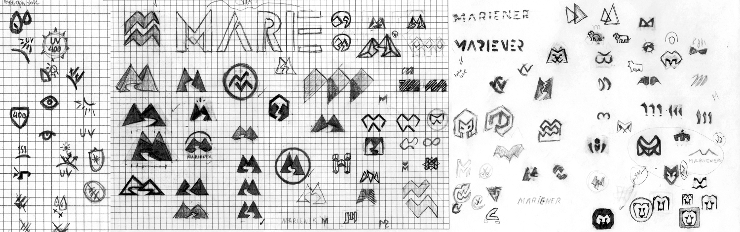
Identity
The Dutch make icon is a lion, but in this case we decide to use a mountain lion to bring the experience of cold and hot environment.
Typography and color


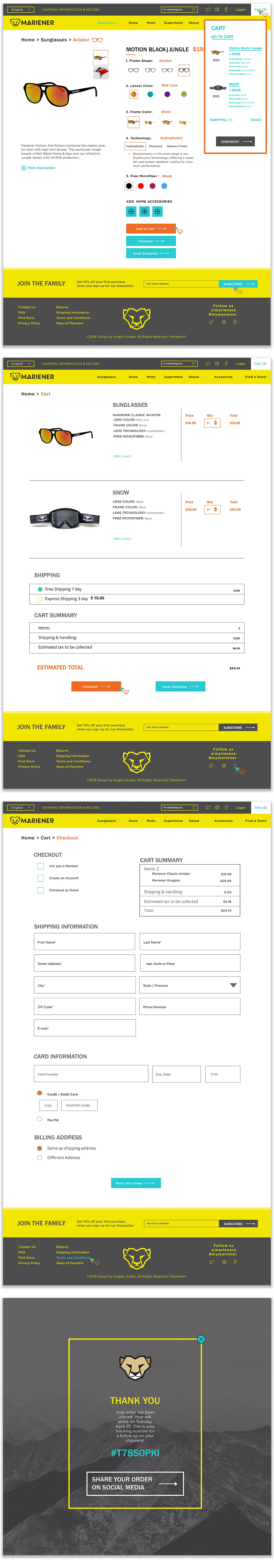
DESKTOP site
For the imagery, we wanted to maintain a feel in of classical luxury and elegance. the brand is known for to maintain the current client base and therfore chose black and white photography. however to draw attention to the product and make the product the focal point and draw attention of new clients we chose to make only the lenses in color.

Research and Initial concepting